
Independent brand archive Identity / illustration / campaign graphics
Built to be
remembered.
Three identities. Three completely different worlds. One willingness to let the idea get weird when the brief calls for it.

01 / Eyes Low
Sweet color.
Strange energy.
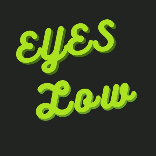
A character-led identity system built to stretch across product names, flavor art, social graphics, and a bold digital presence without losing its attitude.



02 / Fricknaround
Creator energy,
armored up.
A compact emblem for the gaming, making, and experimental side of Jordan’s work. The orange frame, mechanical geometry, and helmet silhouette make the identity feel equally at home on a stream, sticker, or fabricated object.
Visit fricknaround.com03 / Frickin Breezy
Local character.
Nothing generic.
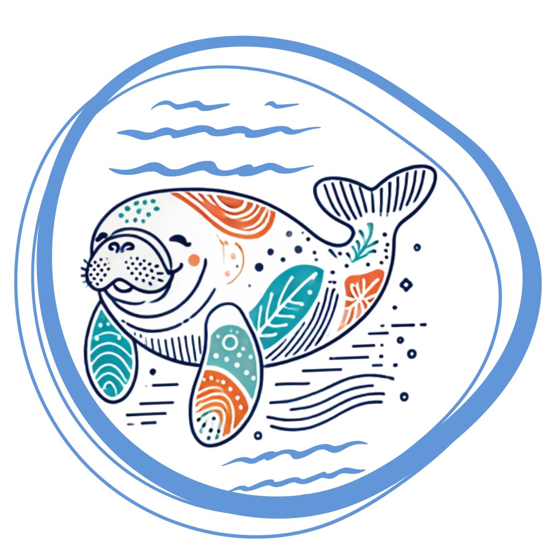
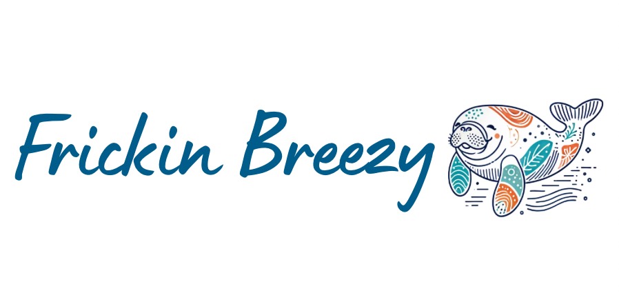
An easygoing coastal identity centered on an illustrated manatee, hand-lettered name, and a sea-glass palette punctuated by warm orange.
04 / Real-estate marketing
Make the listing
feel like an event.
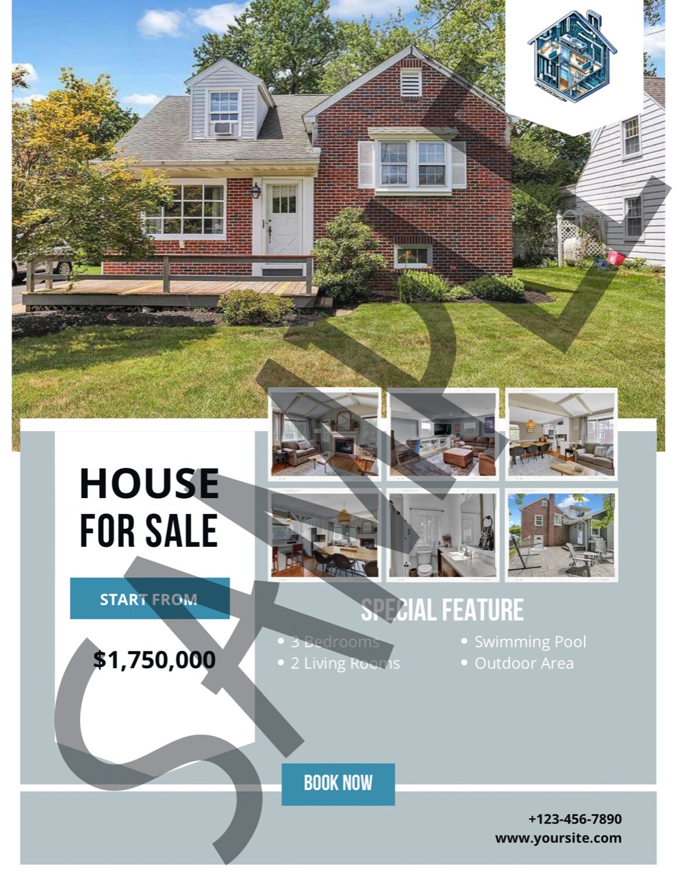
Archived brochure concepts created to help real-estate agents market homes and open houses with a stronger editorial hierarchy, clear property information, and enough visual structure to work in print or digital campaigns.
Shown as historical design samples. Property, pricing, date, and contact information are not current listing information.